

SIP Coffee is a local coffee shop located in the Franklin Park area of Toledo, Ohio, and is one of my favorite coffee shops to sit in when out and about. As an exercise to break my creative block, I chose to re-design their logo, as well as come up with a few marketing deliverables to go along with it.

Every time I go, there is always someone new I meet. Something new I learn. It is a very hip, exciting environment, and it only made sense for my new logo to mimic that. Bright colors bring vibrance to their brand while the type treatment still identifies the place as a coffee shop.
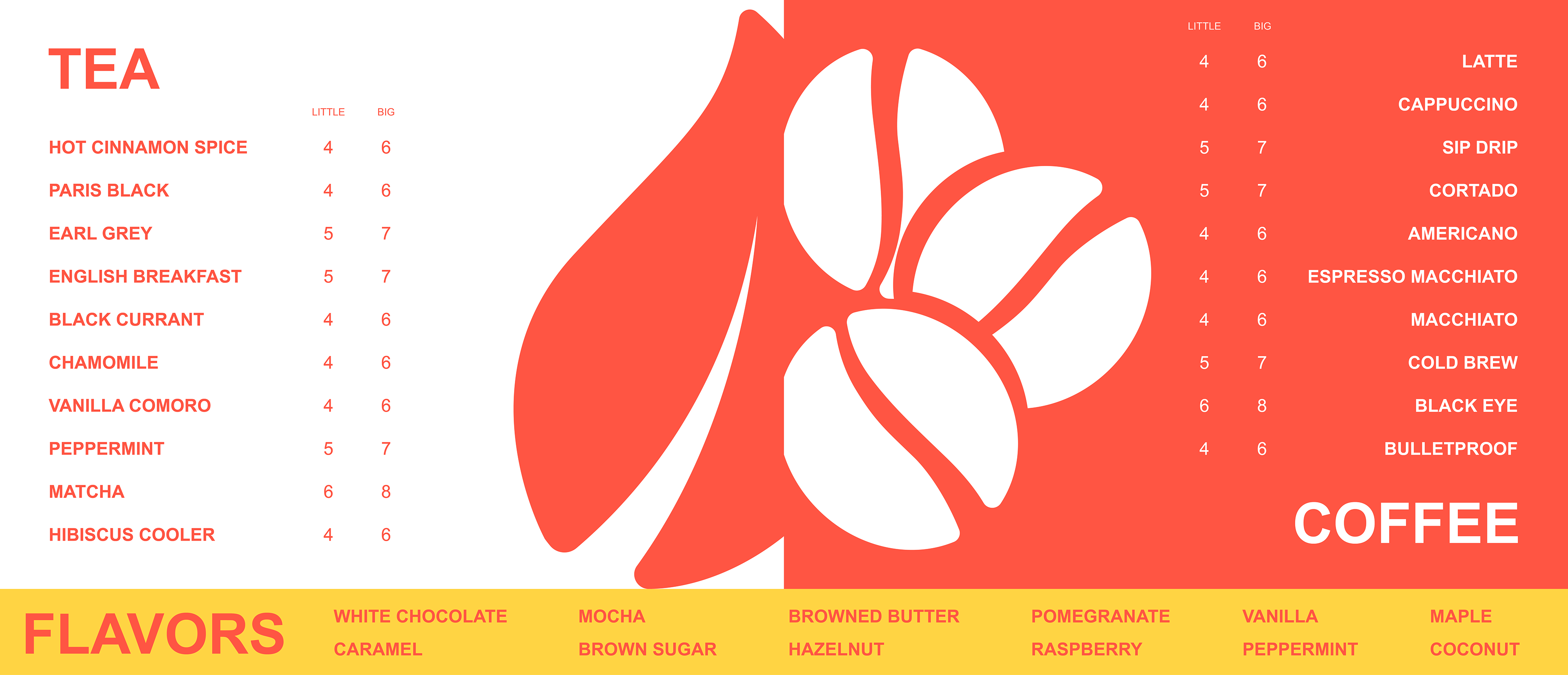
The menu includes some personally made icons that represent certain items on the menu while using the bold colors of the brand to visually separate the different categories. Because of its orientation and sizing, this menu could be printed at different sizes, making it useful for both large menu boards to hang above registers and as printable menus to hand out to customers.

A few different logo variations allow for different marketing uses. The black makes for a better neutral for in-house mugs to be branded. The full color logos make for a great to-go cup for great advertising.
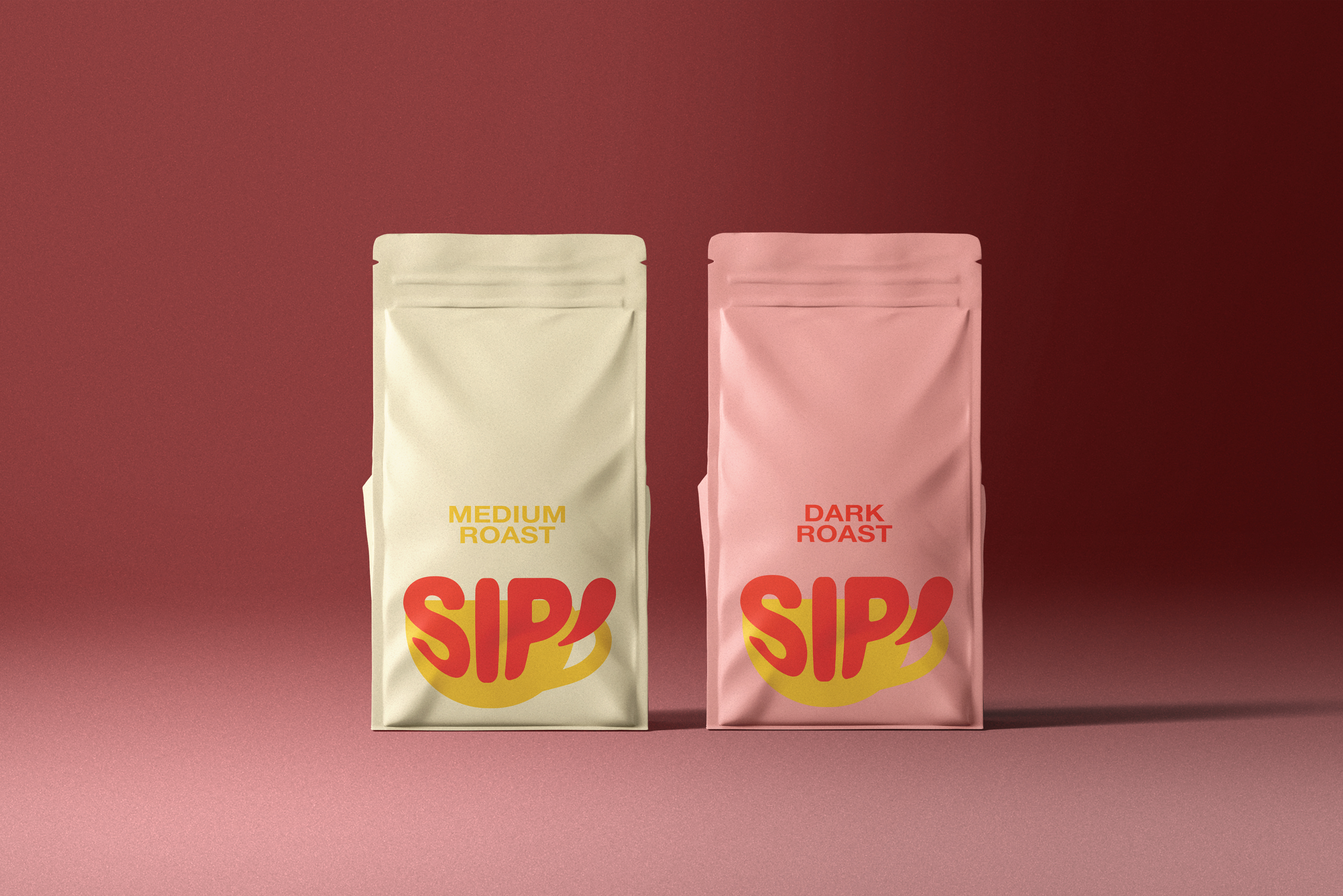
While SIP does not yet offer their own coffee blends for purchase, this is a great marketing area to explore. I make some different roasts for them to sell with the branding loud and proud.