

During my time with the Center for Regional Development, the economic developers chose Bowling Green, Ohio as their community to build up. Their year-long project was focused around reforming the downtown area to accommodate residents of all ages, demographics, and desires to ultimately bring the community together, and the name that best suited this project was Downtown Forward.
In order to get this project started and present it to the community for feedback, we needed to give the project an identity that both conveyed the progressive project ideas that we wanted to implement and also combined both parties that were working together to make this happen: the City of Bowling Green and Bowling Green State University.
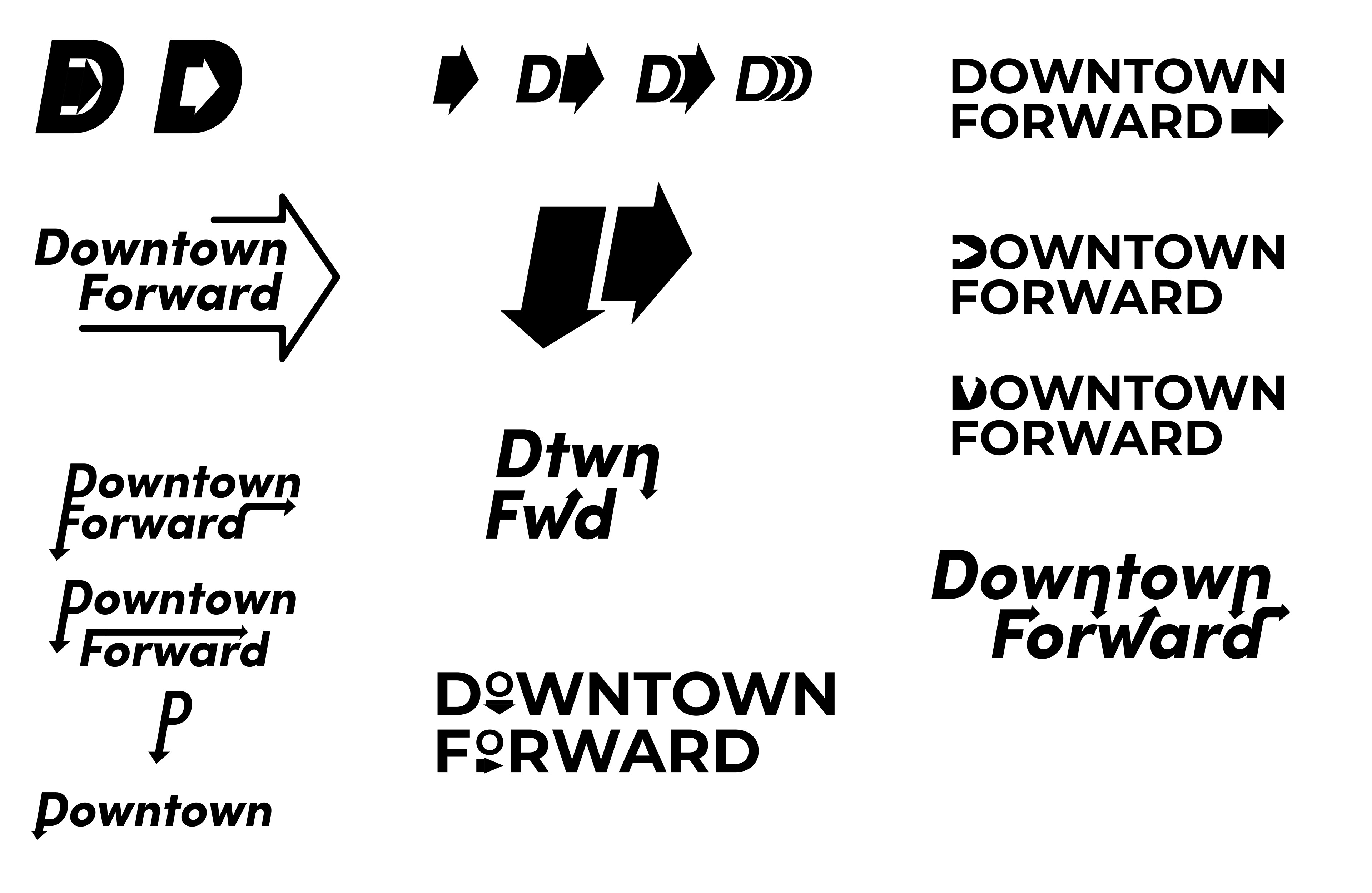
I started with some rough sketches of ideas that I had, going through the cliches and weeding out any basic ideas that I had came up with first. Examples of this are obvious arrows and other imagemarks that were very "in-your-face". From there, more complex ideas were able to form. These included manipulating typography by stretching the letterforms, using negative space within the letterforms, and adding other shapes into letterforms to create a letterform that kept the idea of each but still added interest and the idea of Downtown Forward into it.
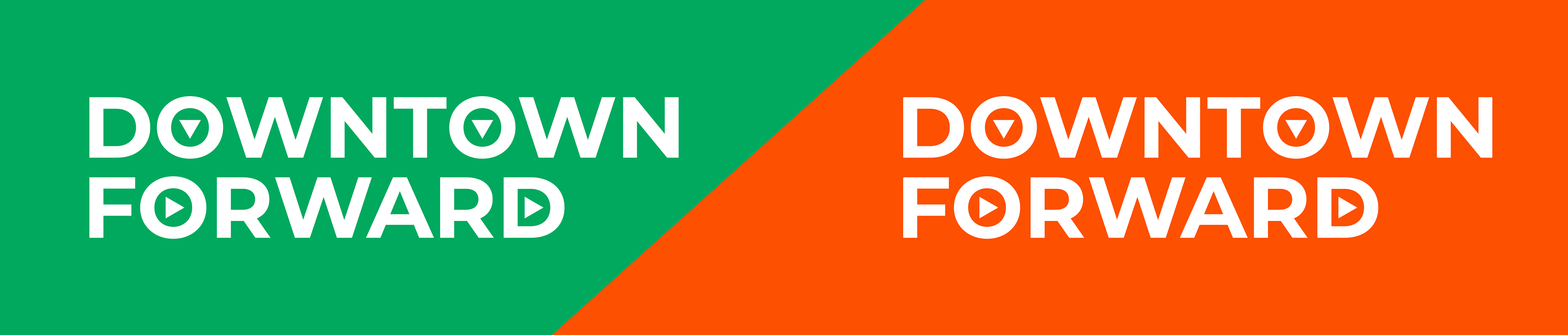
Ultimately, the best idea for a logo was to keep it as a wordmark to make the idea as straightforward as possible and made it easy to understand without any previous knowledge or research necessary. Using a sans serif font made it easy to read at smaller sizes. Using simple triangle shapes as arrows provides a concept of motion into the logo, simplifies the idea of an arrow that mimics the typeface, and provides an opportunity for motion graphic use if ever desired.
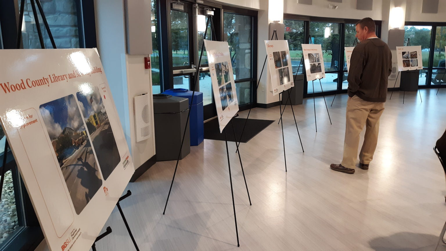
Photo from BG Independent News
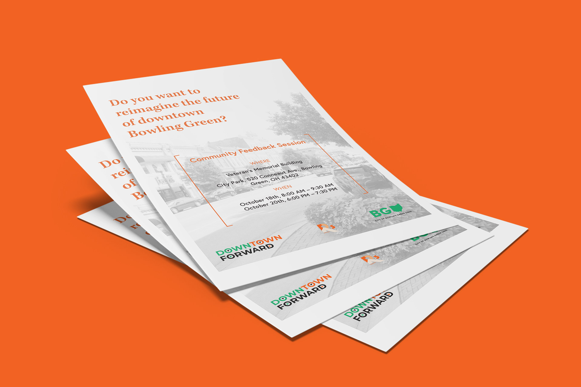
The final logo combines both orange and green, which are the primary colors of the BGSU and City of Bowling Green brand standards. Alternating the colors of the arrow shapes within the counters of the letterforms allows for a subtle interest while still keeping it cohesive. The final logo was used on posters used all over town during community feedback events, on flyers that were handed out in local businesses, and on local Bowling Green websites and news sites.