
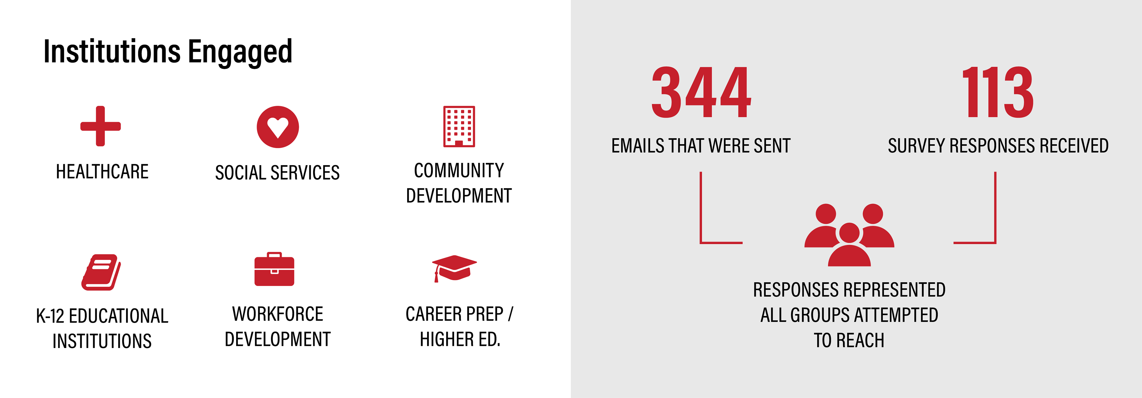
The Digital Literacy in Lucas County project was conducted by the economic developers at BGSU's Center for Regional Development and the Toledo-Lucas County Public Library in order to analyze the accessibility of Internet and devices in the Toledo Region and how lack thereof affects the work of those residents. As part of the final report StoryMap, I was asked to create a series of infographics to visualize the various collections of data that were collected.
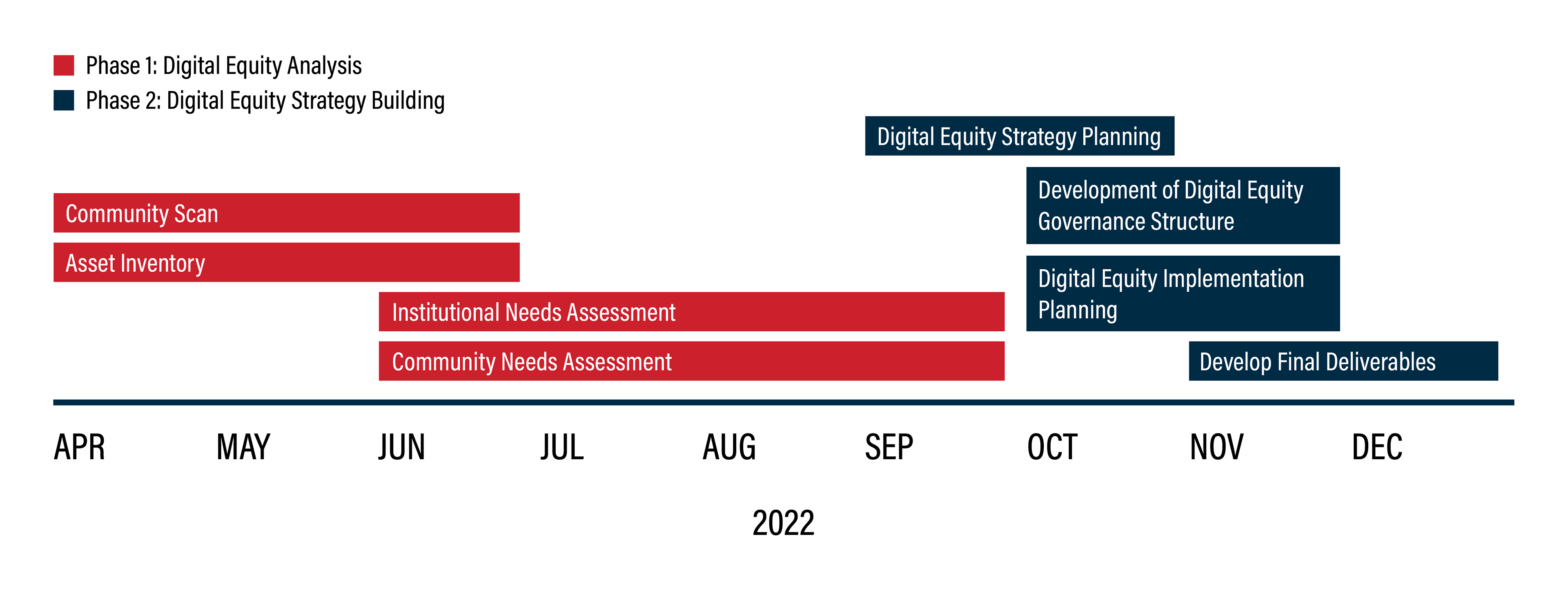
To start out, I visualized the timeline that was set up by the economic developer and separating each phase by colors coming from TLCPL's brand guidelines. The plan spanned from April to December of 2022 with the final report production beginning and ending in January of 2023.


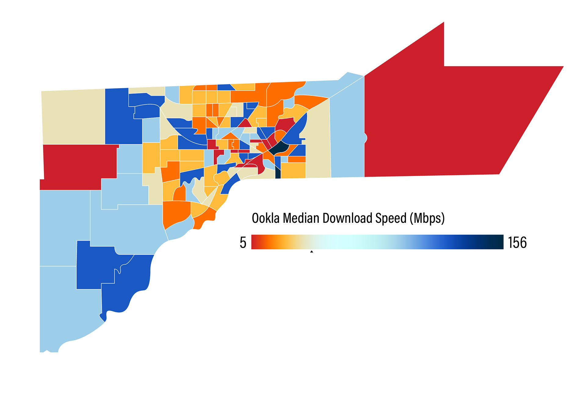
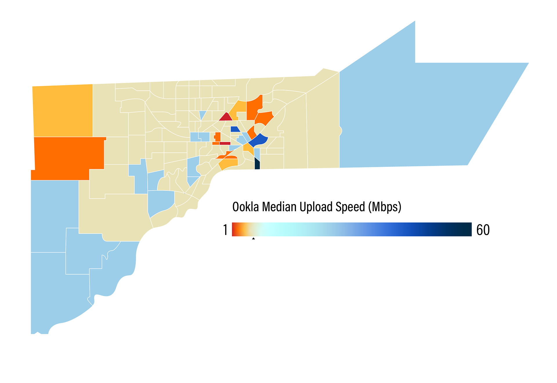
The next step was to visualize the upload and download speeds in each area of the county by U.S. Census tracts. Each set represents the same data but in different formats. It was important to illustrate both the differences in speeds between each census tract while also illustrating where the census tracts lie and how they cluster together based on the speeds.
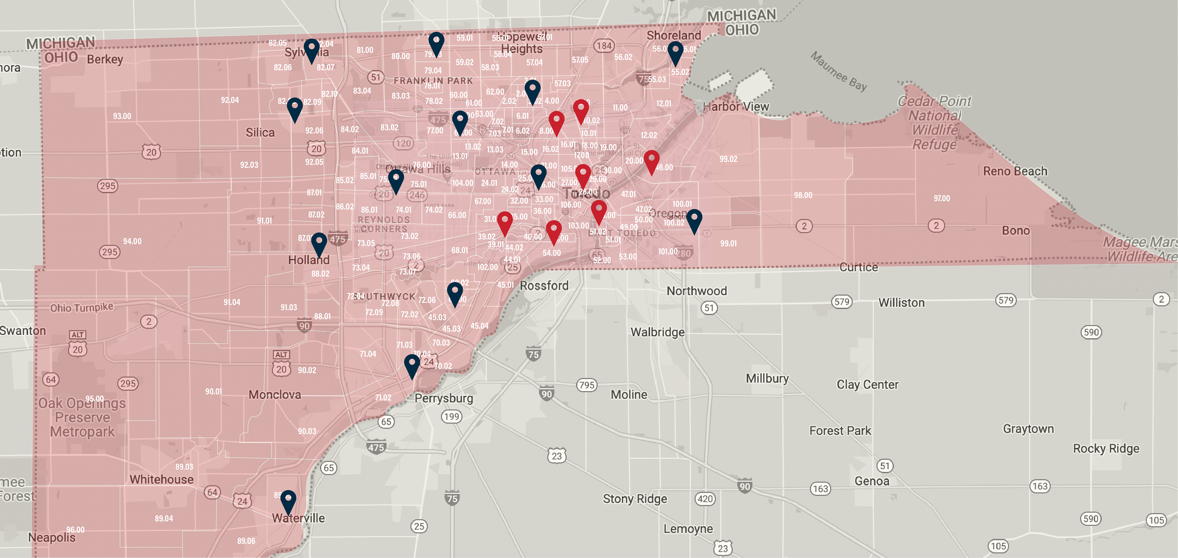
In this report, they wanted to point out that the areas, identified as "Hot Zones" in red, that had slow Internet speeds, lack of access to the Internet, and lack of access to devices do have branches of the Toledo-Lucas County Public Library within for these residents with lack of accessibility to utilize.
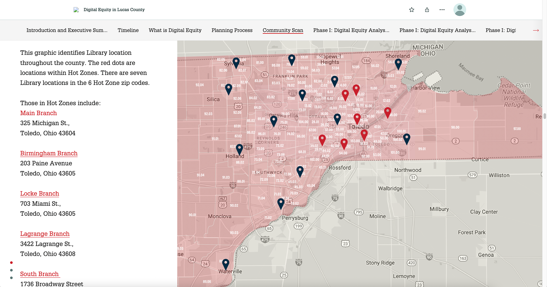
While creating this, there were a few different overlays that I needed to fit without crowding the design. To accomplish this I played with opacity to show all of the layers that were necessary to convey the information that was collected.
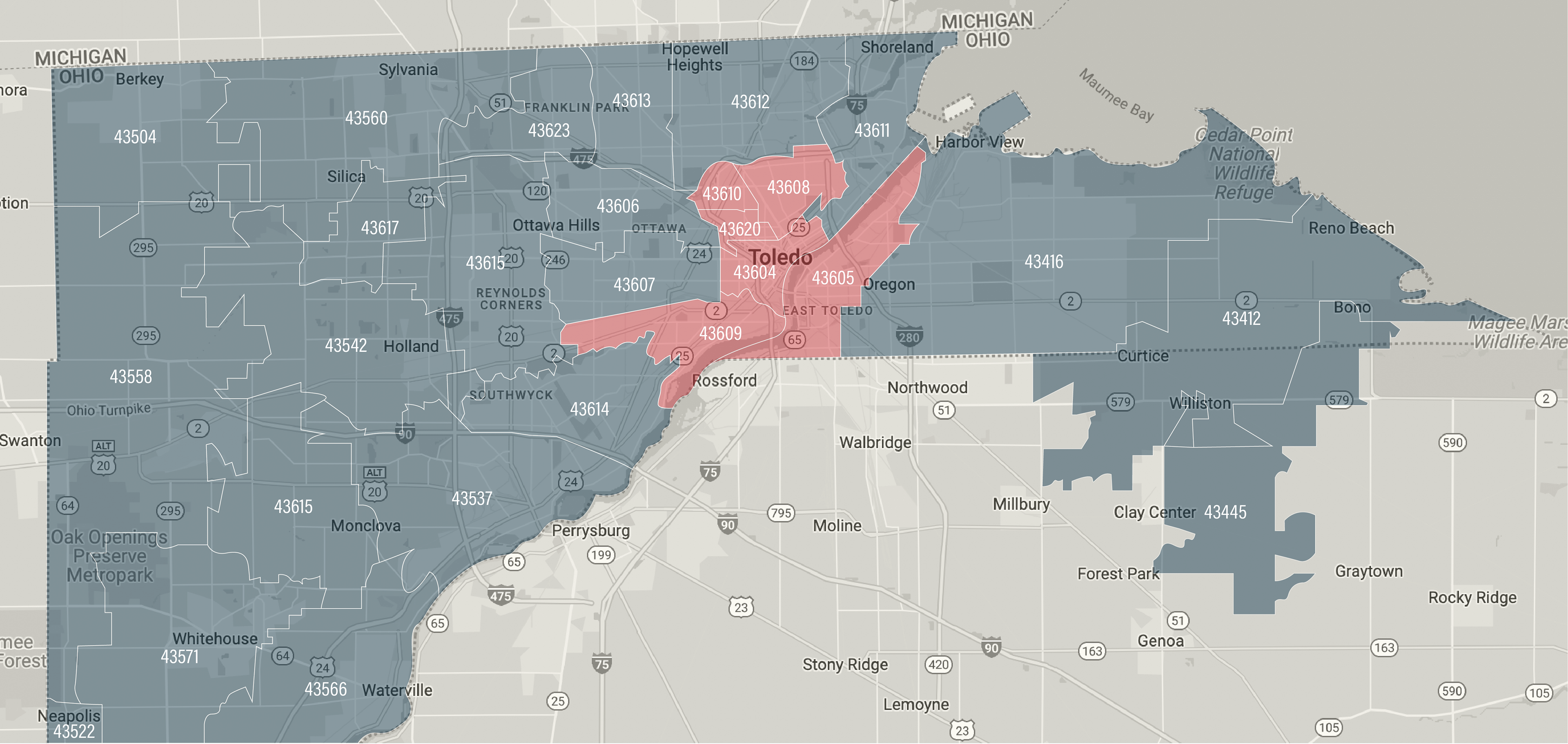
Similarly, I created another map of the same information. However, instead, this map overlays the zip codes with the "Hot Zones" in red.

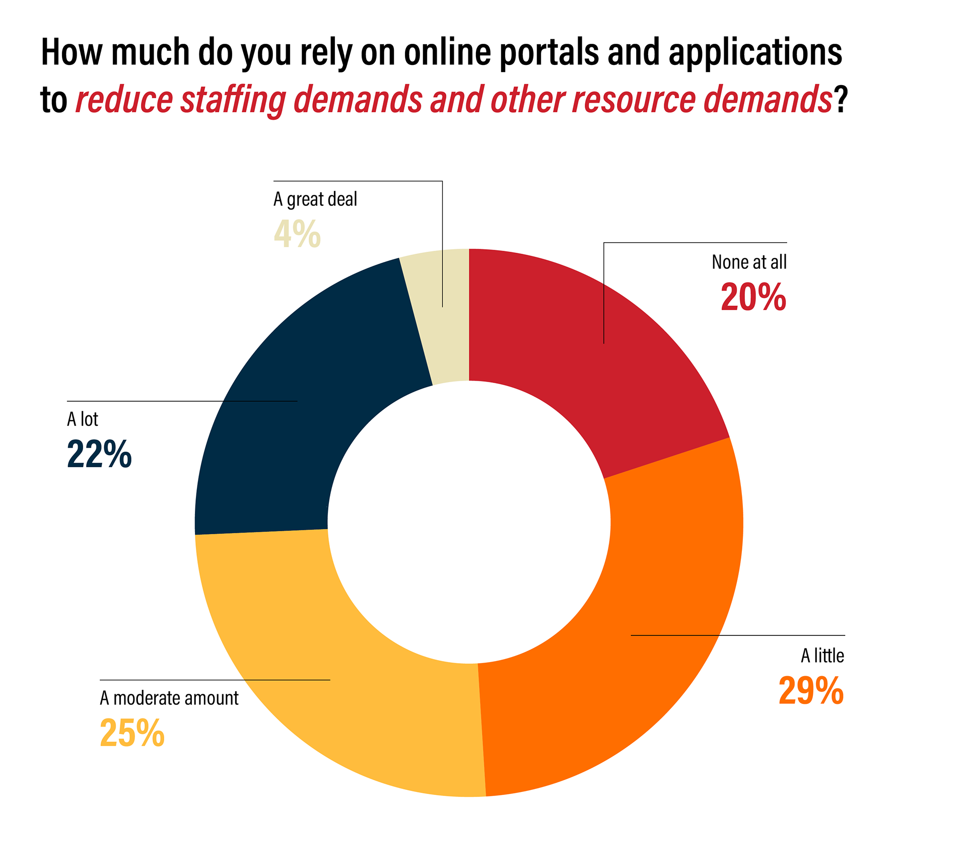
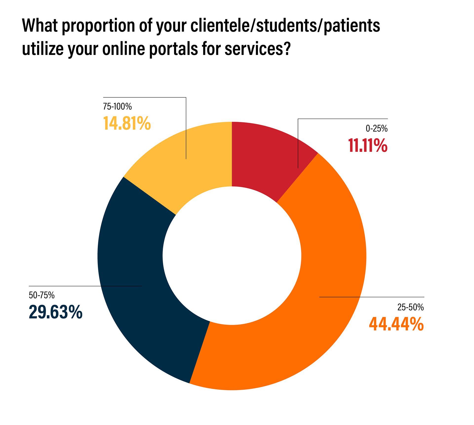
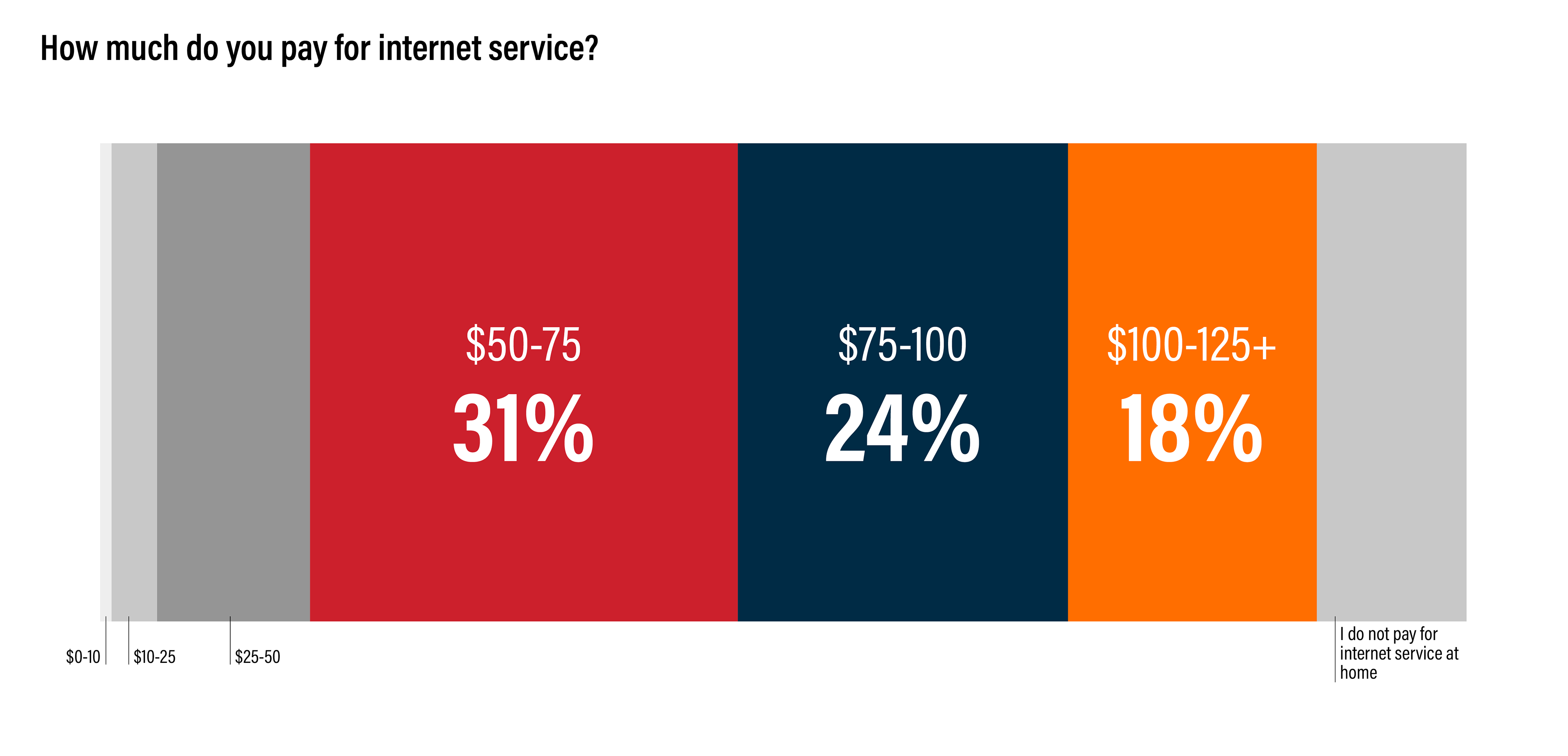
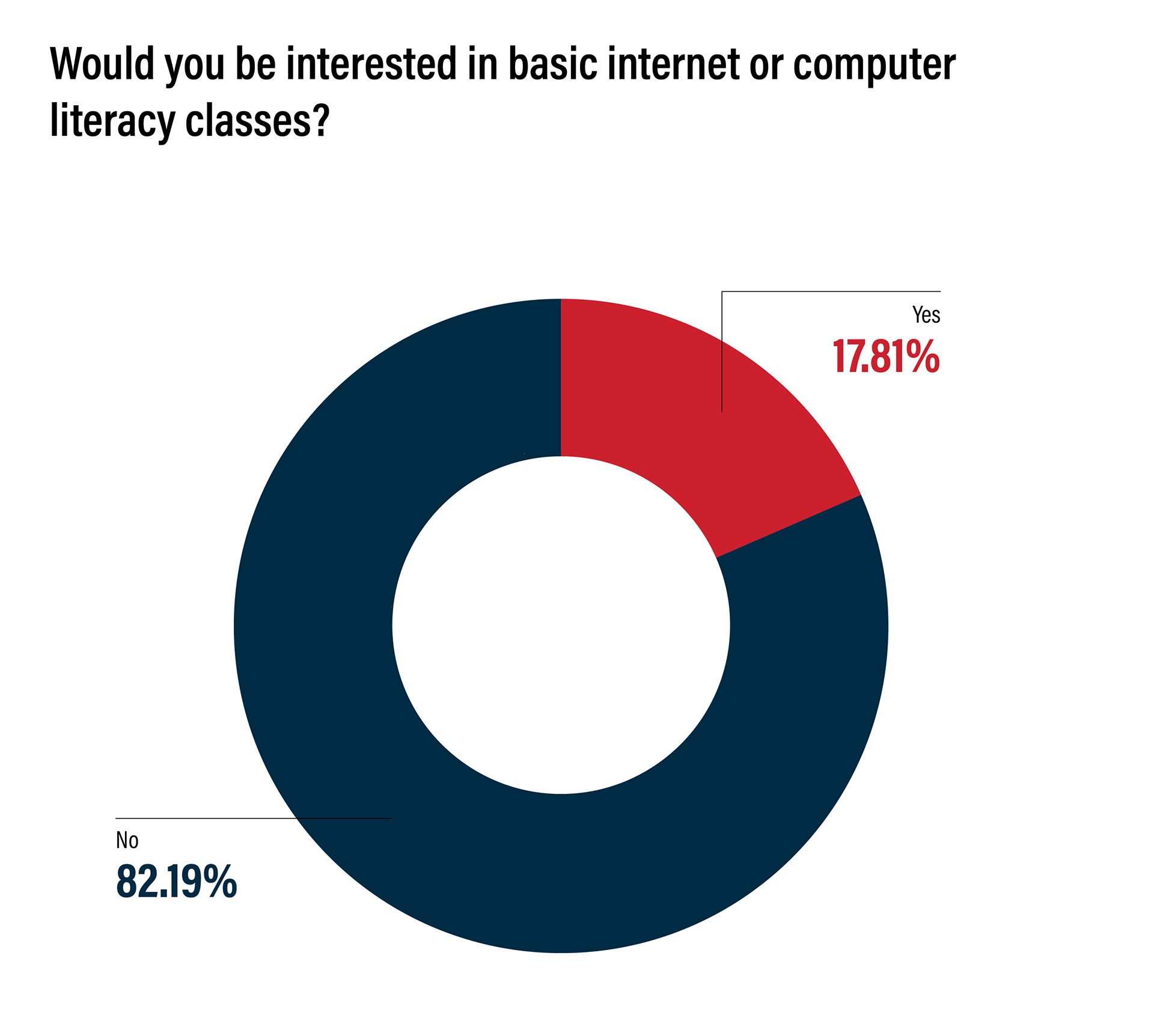
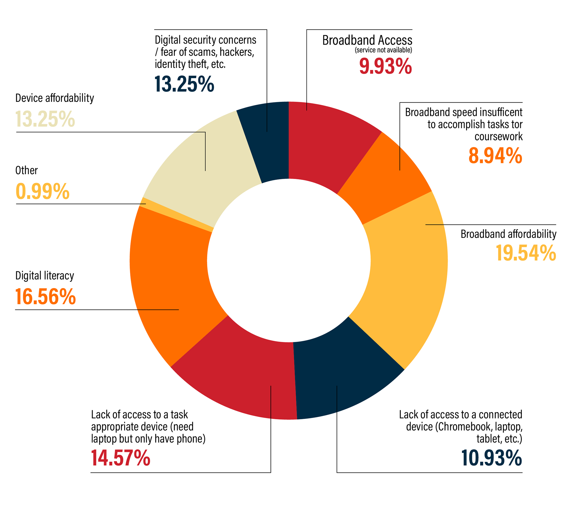
This last set of data came from survey answers from users of the Internet and online portals and how much they rely on them to accomplish everyday tasks. This project was a great way to create a wide range of infographics and be able to teach myself more about data visualization and how different graphics can convey different points of data in better ways than others.